 Artist Statement
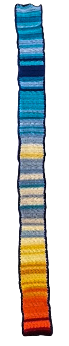
Many people have seen temperature blankets pop up on our social media feed, but if you have not, temperature blankets (or other fiber art projects) are fiber records of the temperature over a set period of time. These striking projects are created by associating set temperature ranges with associated fiber colors to create unique temperature records. Typically, a row is added to the project each day after selecting the color that corresponds with the day’s temperature.
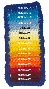
The potential to document global warming in such a visually impactful way has always captivated my imagination; naturally I jumped on the chance to make global warming tangible (and wearable) while living in the greenbelt. This scarf documents annual global average temperatures from 1880 through 2016, with 1880 beginning in blue and 2016 ending with the hottest temperature in red. Each color indicates how many ℃ the average global temperature that year was above or below the average global temperature during the entire 1880-2016 period. Check out the key to help you interpret the color scheme. Hope this inspires you to whip up your own hard-to-miss global warming conversation starter!
Works Cited
“Global Temperature Time Series.” DataHub, 2018, https://datahub.io/core/global-temp#readme.
Justus, Kara. Global Temperature Scarf. Accessed 26 Jan. 2023.
Justus, Kara. Global Temperature Scarf Key. Accessed 26 Jan. 2023.