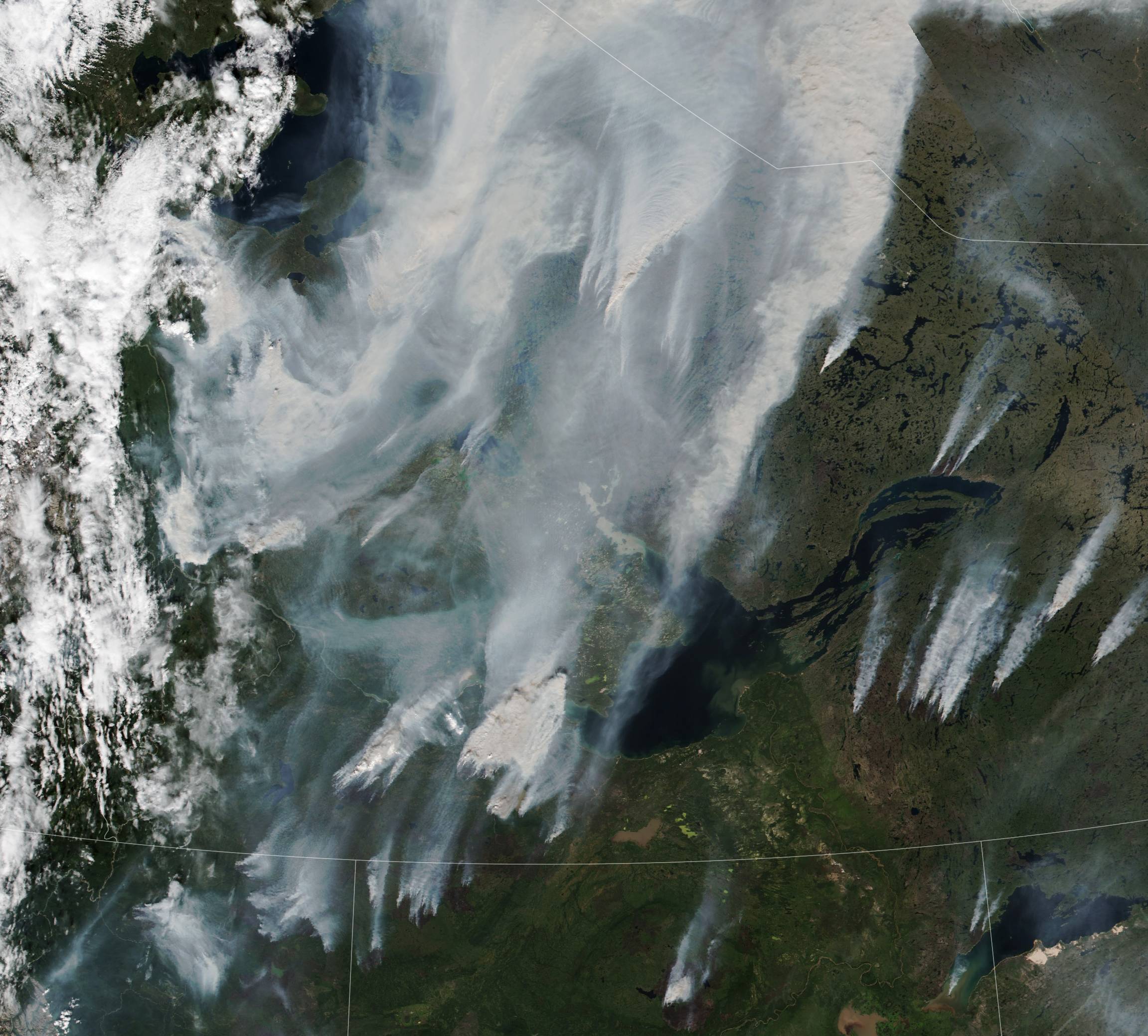
We are taking a break! Will be back soon!
Algal Bloom in South Atlantic
On January 19, 2014, the Moderate Resolution Imaging Spectroradiometer (MODIS) on NASA’s Aquasatellite captured this image of a bloom of microscopic organisms off the southeastern coast of Brazil. Note how the waters of the South Atlantic are darkened in patches stretching as much as 800 kilometers (500 miles) from south to northeast across the continental shelf. In the image, the puffy strands of white over the sea and inland are clouds.
Biologists working in the area have identified the bloom as Myrionecta rubra (previously known asMesodinium rubrum), a fast-swimming ciliate protist. Though it is not a true phytoplankter, it is an autotroph; that is, it makes its own food. Myrionecta fuels itself by photosynthesis, but it does so byingesting chloroplasts (chlorophyll-bearing plastids) from other algae. Aside from threatening the microscopic algae it consumes, Myrionecta rubra is not known to be toxic to other marine life or humans.
Viewed close-up, these blooms have a deep red color. But this bloom appears nearly black in the satellite image because of how the ocean scatters and absorbs sunlight. Myrionecta rubra blooms tend to float a meter or two below the water surface, so whatever photons of red light they are reflecting are likely being absorbed or scattered on their way back to the surface.
Closer to shore—look near Rio de Janeiro and Sao Paolo—the water has a green tint, perhaps signs of a different bloom of phytoplankton or of sediments stirred up by recent flooding in the region.
GIS Day Lunch
We enjoyed our conversation about maps during our belated GIS Day celebration. Here’s the mapping resources presentation. Let Mike or Suresh know if you have any questions!
Global Warming Mapped by NASA Satellites
Long term climate study by NASA using data acquired through a variety of sources including weather stations across the world, ships, and many satellites show an increasingly warming trend in the world over the last 30 year period. The satellite images below show the temperature anomalies. This shows that irrespective of what is causing this trend, the world is getting warming.
Read the full information on NASA website: http://earthobservatory.nasa.gov/IOTD/view.php?id=47628&src=eoa-iotd
How Food Shapes Our Cities
Ted Talks on how food shapes our cities.
[kml_flashembed movie="http://www.youtube.com/v/CLWRclarri0" width="425" height="350" wmode="transparent" /]
Visualizing the World – Wow!
This is a really powerful tool for viewing global statistics that might be useful for class. The visualizations in Hans Rosling’s presentation are pretty amazing.
The tool Rosling uses in the presentation is available online (along with his blog). It took me a little while to figure it out how to use it, but experimentation with the maps and charts, along with the video tutorial, really helped me realize how much is here.
Indicators include health, economic, education, environmental, and more data from the UN.
The site also provides information about how you can use Google Spreadsheets to make your own motion charts. I experimented, and the process is fairly straight-forward for charts but doesn’t include the mapping piece, which is available for the UN data on Rosling’s site.
Total Oil Consumption – Let’s get on those bikes or carpool America
Change in blog server address
It’s been a year since the last post here. We have had some issues with the old blog server and now moved to a brand new blog server that is maintained by Furman C&IS folks. It should be faster and better now. The new address is: https://blogs.furman.edu/gisnews/
Great Wal(Mart) of America
Some great flash animation and cool data set to go with to study the spread of WalMart across America is available from the following two websites.
Flash Animation of WalMart Growth
If you like what you see there, check out the following website for a report and the data associated with this.
Census Atlas of the United States
This is a good resource for a lot of us who use census data in our classes or in our research. Whole atlas is available in digital format (PDF). The description as shown on the census website is below.
“We are pleased to present the complete content, in PDF format, of the recently published Census Atlas of the United States, the first comprehensive atlas of population and housing produced by the Census Bureau since the 1920s. The Census Atlas is a large-format publication about 300 pages long and containing almost 800 maps. Data from decennial censuses prior to 2000 support nearly 150 maps and figures, providing context and an historical perspective for many of the topics presented.
A variety of topics are covered in the Census Atlas, ranging from language and ancestry characteristics to housing patterns and the geographic distribution of the population. A majority of the maps in the Census Atlas present data at the county level, but data also are sometimes mapped by state, census tract (for largest cities and metropolitan areas), and for selected American Indian reservations. The book is modern, colorful, and includes a variety of map styles and data symbolization techniques. ”
Click the map to go to the link or copy and paste the url below: